Our kitchen....well, it needs some light/brightness to it. It feels too dungeon-y. It's the way my husband likes it, but since perusing Pinterest lately, I'm loving all of the bright white kitchens.
Since the hubbers won't agree, yet, to painting our cabinets white, I decided that we'd add a little white-ness to the sink area. (next up is some light colored backsplash)
Quick back story about our home: we bought our 3003 sq ft home with the bare minimum (meaning, we didn't pay an arm and a leg for it). mainly because we didn't pay for extra things like, backsplash in the kitchen, hard wood floors, tile, crown molding, granite countertops, etc. we decided that instead of paying interest on all of the "extras" for 30 years, we would just do it ourselves over time. and in the end it would save us some coins. plus, we like doing stuff ourselves. so it's a plus plus or a win win.
Anyway, here's what our kitchen sink-area used to look like (horrible picture, my white balance is way off):
See....boring and dark. oh, that valence....it needs to go pronto. momma hasn't had time to sew lately or find the right fabric or design. slacker.
Leave it to trusty ol' pinterest to help with some inspiration. Here's what I pinned. Talk about aweseom-ness.
For a while now, I've wanted something for this area. I debated on putting 2 to 3 shelves on each side of the window hanging off of our cabinets like the first picture above. But since it's a small space, I didn't want it to look too cluttered. I figured one shelf all the way across the window would be perfect. It's a perfect spot for some potted plants and various little trinkets and maybe even our soap dispenser. Now I can use these or these that I made a while back.
We stared by using some leftover wood to use as our shelf from this project. We sanded it, put a little primer on and added a coat of white paint.
I found these $5 wood brackets at home depot.
I applied 3 light coats of spray paint and they turned out white and glossy.
After doing some measuring (Jer, the brainiac, of course) we decided that we would put the bottom of them slightly above the bottom of the shelves. So when we put in backsplash we won't have to take the shelf down and move it up. The backsplash will just go right under the bracket.
Love the height and texture it gives to the sink area.
We opted for rounded trim that we glued (using Gorilla Glue) onto the front of the shelf for a little curvature.
evening pictures with kitchen lighting.
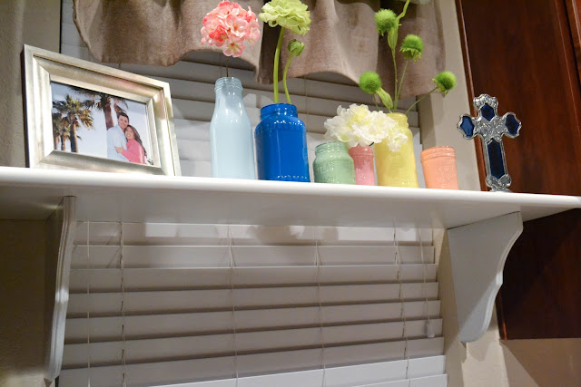
I love love the outcome. The decor will change every so often, but for now, the colored acrylic jars are there for now.


1 comment:
I'm new to your blog & loving all the makeovers you do! & your sweet little boston is just too cute!!
Hannah
cjnmommazrazzi.blogspot.com
Post a Comment